Responsive Drupal Themes
Mobile & Desktop
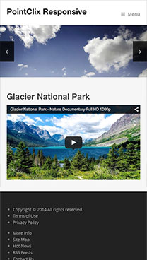
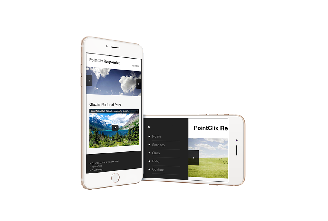
Responsive Themes
"Mobile first” Responsive web design is an approach to layout design aimed at crafting sites to provide an optimal viewing experience across a wide range of devices from a desktop computer to mobile phones.
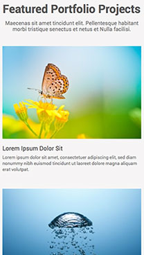
Responsive Modules
Do you need your media & menus to respond to browser size just like your website? Change to responsive galleries, slideshows, menus & video players.
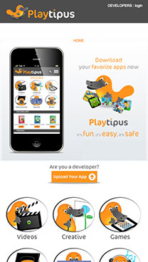
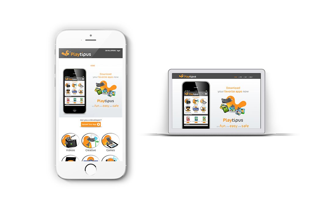
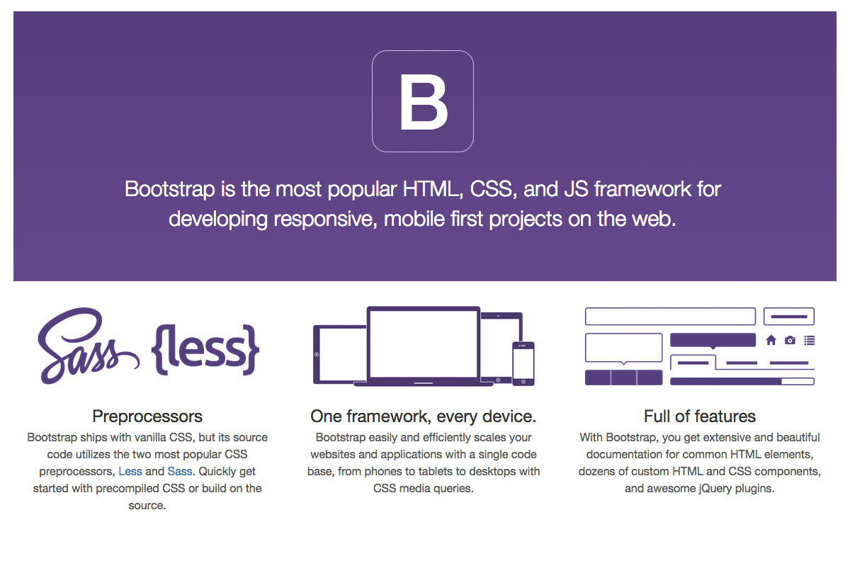
Bootstrap
Bootstrap is the most popular front-end framework for "Mobile first" projects. It contains HTML and CSS-based design templates that can be integrated into Wordpress theme page templates. As of February 2015 it was the No.1 project on GitHub.
PSD to Drupal Responsive Theme?
We can turn your PSD graphic design into a functioning & Drupal responsive theme.